
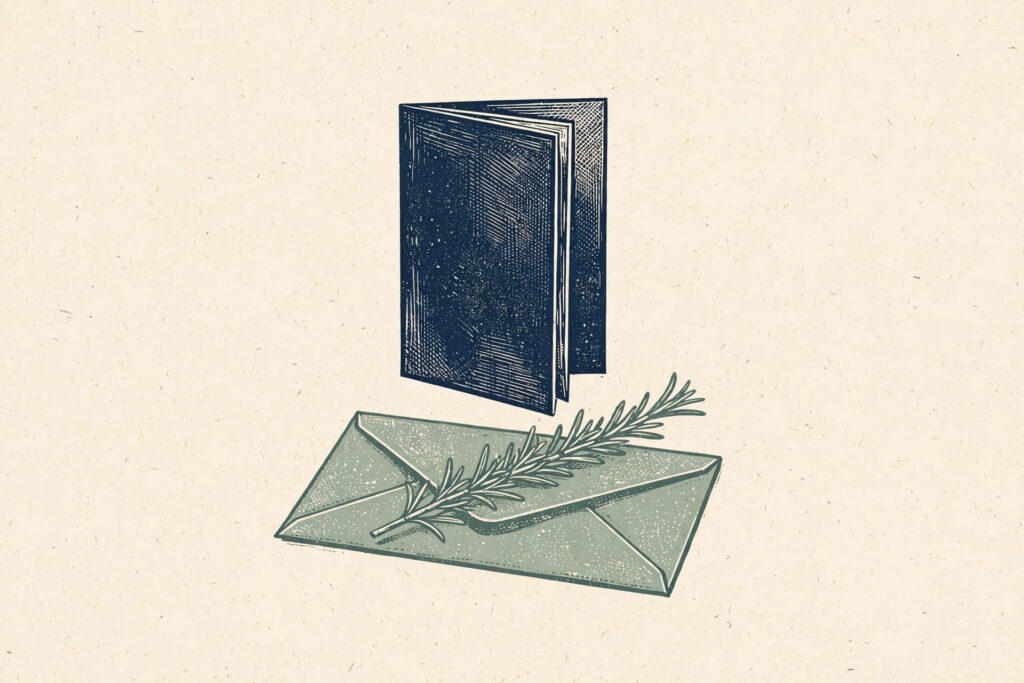
Fold a sheet of cream paper in half and stand it on a windowsill. From a few feet away, all the fine detail disappears. What remains is the outline of the illustration and the weight of the title. That is how I would begin designing a small Memorial Day program for a community gathering. The cover should help someone recognize what they have been handed and give the names and readings inside room to be heard.
My working idea is a single sprig of rosemary lying across a folded envelope. The envelope would be plain and closed. It would carry no invented name, postal mark or military insignia. Its purpose is to suggest a personal letter without claiming that this imaginary object belonged to an actual service member. If the organizers have a real letter they wish to reproduce, that would be a separate decision made with the owner of the letter.
For this sketch I would set myself a two-ink limit. A muted green would carry the sprig and a deep blue would carry the envelope outline and the title. The cream stock would supply the third color without adding ink. That choice makes sense for a modest printed program, but it also gives the design an editorial discipline. Nothing can depend on a dozen gradients to become recognizable.
Fold the paper before drawing the cover
I would mark the fold, trim and title position on a real sheet before opening the image editor. A sprig angled toward the fold could disappear into the spine. One angled outward could lead the eye off the page. I would place the cut stem near the lower right corner and let the tip point back toward the middle, just below the intended title. The envelope would be almost horizontal beneath it.
With the folded sketch as a reference, Seedream 6.0 could help me try a simple relief-print treatment for the illustration. I would describe a single blue envelope outline and a green sprig with a few distinct clusters of narrow leaves. The frame would be empty around them. I would ask for an unlettered picture, then add the approved wording and the correct local event details in the layout file.
An early version might show a letter partly emerging from the envelope. That is a tempting image because it creates another shape to work with, but it also invites writing that does not exist. I would keep the envelope closed. The small triangular fold on its back is enough for recognition. If the model produces a wax seal or an elaborate ribbon, those details would go as well.
If you are planning the service itself as well as its printed cover, our complete Memorial Day 2026 guide covers the date, traditions and how the day is observed.
Decide which marks will hold on the press
A branch of rosemary contains more thin leaves than a small cover needs. Looking at a Seedream 6.0 study at full screen, I might enjoy every little needle. On an inexpensive proof, those same marks could merge into a heavy green stripe. I would select a few leaf clusters, vary their lengths, and leave enough paper between them for the branch to read when held at arm’s length.
The edge of the envelope presents the opposite problem. A line that is too fine can break up on textured stock. A line that is too dark may make the paper object look like a slab. I would print three small samples at the actual program size with different line weights applied in a graphics editor. The best choice would be the lightest version that still makes the folded corner immediately visible.
When revising the Seedream 6.0 illustration, I would check the points where the green crosses the blue. In the layout, the sprig should appear to rest on top of the envelope. If the blue edge continues across the green stem, the objects can look woven together. A tiny interruption in the blue line where the stem passes over it would explain the overlap without a cast shadow or another color.
Where names belong
I would reserve the inside spread for information supplied and checked by the organizers. The image model would have no role in producing a list of names, ranks or service dates. Even an invented word on an envelope can look like the beginning of an attribution. For the Seedream 6.0 cover, keeping the paper unmarked would protect the distinction between the symbolic front illustration and the factual record on the inside.
On the front, the event name could sit in a plain typeface with wide margins. I would print the first proof without embellishments around that line. If the heading looks too isolated, moving the illustration slightly closer is a quieter solution than adding stars or ornamental borders. The envelope and sprig should feel like the deliberate contents of a page, not two elements stranded at the bottom of an empty poster.
A useful practical check would be opening the program while standing. If the inside text starts too close to the fold, someone may have to flatten the booklet to read a name. That observation might prompt a change to the whole page grid, including the front. I would make that adjustment in the page layout rather than asking the image model to squeeze the illustration into a newly narrowed space.
Getting the cover details right starts with the basics — check when Memorial Day 2026 falls before printing the date, and if your program includes a reading, choose words from these Memorial Day quotes to remember our heroes.
A proof that can travel from screen to paper
I would hand the chosen Seedream 6.0 art to the printer as a visual reference alongside the prepared layout. A digital picture that looks green and blue is not automatically a two-ink production file. The printer could confirm how the two colors should be separated and what line widths the chosen stock can support. A paper proof would settle those questions more reliably than a large preview on a bright monitor.
For a web announcement I would keep the illustration separate from the live event text. A short horizontal crop could feature the same envelope corner and sprig, with the date and gathering place entered as regular page text. If a detail changes, the organizer can correct it without rebuilding the drawing. A brief description of the symbolic illustration would also help a reader understand the visual without seeing it.
For more ways to honour the names printed inside, see these Memorial Day tribute ideas.
The last Seedream 6.0 revision I would consider is the smallest one. If the stem is lost against the blue edge at program size, move it a little. If a fine leaf has become a fleck, remove it. Then set the proof back on the windowsill and look from a few feet away. An envelope, a sprig, and enough space around the title would be sufficient for a cover whose real purpose begins when it is opened.